Newspapers and magazines. Both convey information through text, photos, graphics and illustrations. Both reach millions of people every day. Both have traditionally been a prime example of print media. The similarities are high, but their differences outnumber these greatly.
Newspapers target a large population, while magazines are more specialized. Magazines are more editorial (entertainment based), where newspapers are largely factual (information based). Newspapers often have a much quicker turnaround time, coming out daily, bi-weekly or weekly, while many magazines are monthly or even quarterly. Magazines are typically printed on a heavier, glossier paper and newspapers are printed on a thiner, porous paper. For these reasons, as well as many others that I didn't list, newspaper and magazine design differs greatly.
The factual, 'hard news' format of newspapers is, perhaps, the most significant reason for the differentiation in design. The strict, column-based grid structure of newspapers projects credibility. This comes from years and years of similar newspaper design. We as consumers, tend to give more trust to the things that we are familiar with. A reverse example of this, is the adoption of this type of layout by gossip tabloids. By printing on newsprint and adhering to a newspaper-like column structure, they hope to appear credible and factual. Newspapers are also dictated by a number of other factors, including a quick turnover time, lower quality paper, whether or not they will have color, etc.
Because magazines are typically more entertainment based, they are able to play with design more as they are not bound by the constraints of being the watch dog informant. They are also almost always full color and printed on a heavier, glossy paper stock, allowing for more detailed, intricate designs.
As of recent though, newspapers have begun to morph and change slightly in order to compete as a print product living in a digital age and are becoming more design heavy and magazine-like as to attract readers and get them their information in an easily manageable and relatively entertaining way.

Showing posts with label Tech Journal. Show all posts
Showing posts with label Tech Journal. Show all posts
Monday, April 2, 2012


Friday, March 30, 2012
Tech Journal: Types of Printing
Xerography = Dry printing. A dry pigment is 'cooked' on top of the paper. Widely used as general office printing because it is cheap and quick, however lower quality. Not cheapest option for very large quantities.
Inkjet = Common household. Words best on photo paper. Liquid ink squirts out drops of ink as the paper goes by.
Sublimated Dye (Dye Sub) = Uses some kind of solid ink. A solid sheet of color (similar to carbon paper).
Photographic = Dark room processed with special papers and chemicals.
Sheet-fed Offset = Most common general printing in print shops. Uses liquid ink, paper not on roll - separate sheets are fed into the printer. Much less expensive for large quantities than xerography.
Web-fed Offset = Large scale. Newspapers, magazines.
Gravure Printing = A surface is engraved or scarred with tools or chemicals. The scratches get filled with ink and then pressure forces the ink onto paper. The highest quality, detailed printing. Currency is printed this way. The opposite of rubber stamping or flexography.
Flexography = Utilizes a flexible relief plate (similar to a rubber stamp). It can be used for printing on almost any type of substrate including plastic, metallic films, cellophane, and paper.
Screen Printing = Printing on fabric. Most successful if solid or has textures that don't have to look perfect
Monday, March 26, 2012
Industry Profile: Bell, Inc.
A couple weeks ago, I had the opportunity to tour Bell, Inc. in Sioux Falls. Bell is well known across the country for their packaging and shipping products. With clients ranging from UPS to McDonalds, they specialize in:
- Comprehensive packaging services
- Folding cartons
- Overnight envelopes and mailers
- Food packaging
- Quick serve restaurant and convenience store packaging
Tuesday, March 20, 2012
Tech Journal: "Design Elements" Chapter 5 Review Paper
Layout Systems
Almost everything that is designed is part of some sort of system. From a website having multiple connected pages, to the actual physical pages of a book, magazine or newspaper, they all have a connection. Too, is the idea of serial production. The author of the book use the example of a magazine or newspaper being produced periodically, each having different content, but all tied under the one masthead. A systems can also be seen in a series of publications, such as brochures or advertising campaigns. The key to any system is the idea of unity. They viewer of user needs to be able to visually connect the pieces of system in order to know that they truly are connected.
This visual connectedness is extremely important and should be strictly adhered to ... to a point. For example, if every page of a magazine follows the exact same grid structure and image placement, the viewing experience as a whole will be static and lifeless. However, if the designer allows for some flexibility in their design, they create visual tension, which leads to a more lively, energetic viewing experience. But, just like too much consistency is kills energy, too much flexibility kills unity. The perfect balance of consistency and flexibility creates interest while maintaining unity.
Finding this perfect balance can be done a number of ways. Perhaps the easiest way, is to change the color palette or the images used, while keeping the size and position of the rest of the elements exactly the same. This can prove a drastic change in the look of the pieces, while allowing them to stay unified through unchanging staples. Another way to do this is through pacing, or changing the “frequency of different page components in some kind of pattern.” By changing sizing, placement and color densities of elements on different pages of a multi-page document it is possible create that desired interest and energy, but it is important to maintain a common grid structure on all pages to retain the sense of unity.
Flexibility can also be achieved through formal variation. This is achieved by identifying key characteristics in a design — imagery, geometric relationships, depth, movement — and then focusing on altering a couple of them to create interest, without changing “fundamental character.”
This idea of formal variation and the earlier discussed idea of differing components in some kind of pattern, come together to help the designer create a pacing or sequencing within a design. The author likens this to a “kind of cadence or ‘timing’ that the reader will apprehend from part to part.” This cadence is created through varying placement of type, image and white space and can help the designer achieve a number of different objectives. The most obvious of these is just the visual change from page to page creates interest and engages the viewer. In addition, pacing can also help to indicate a change in content — from something as simple as an indention or space between paragraphs, to more complex ideas such as symbols or colored boxes. Good use of pacing can also help to facilitate navigation, such as how the viewer should approach a printed page or how they should click through a website.
The author warns though, that even though all designs will benefit from some degree of flexibility and variation, it is important to decide what method and to what degree on a case by case basis. This will ensure that the message of the pieces comes across clearly and as intended, and that the needs of the client are met.

Source: "Design Elements: A Graphic Style Manual" by Timothy Samara
Sunday, March 18, 2012
Typography: The Cost of Fonts
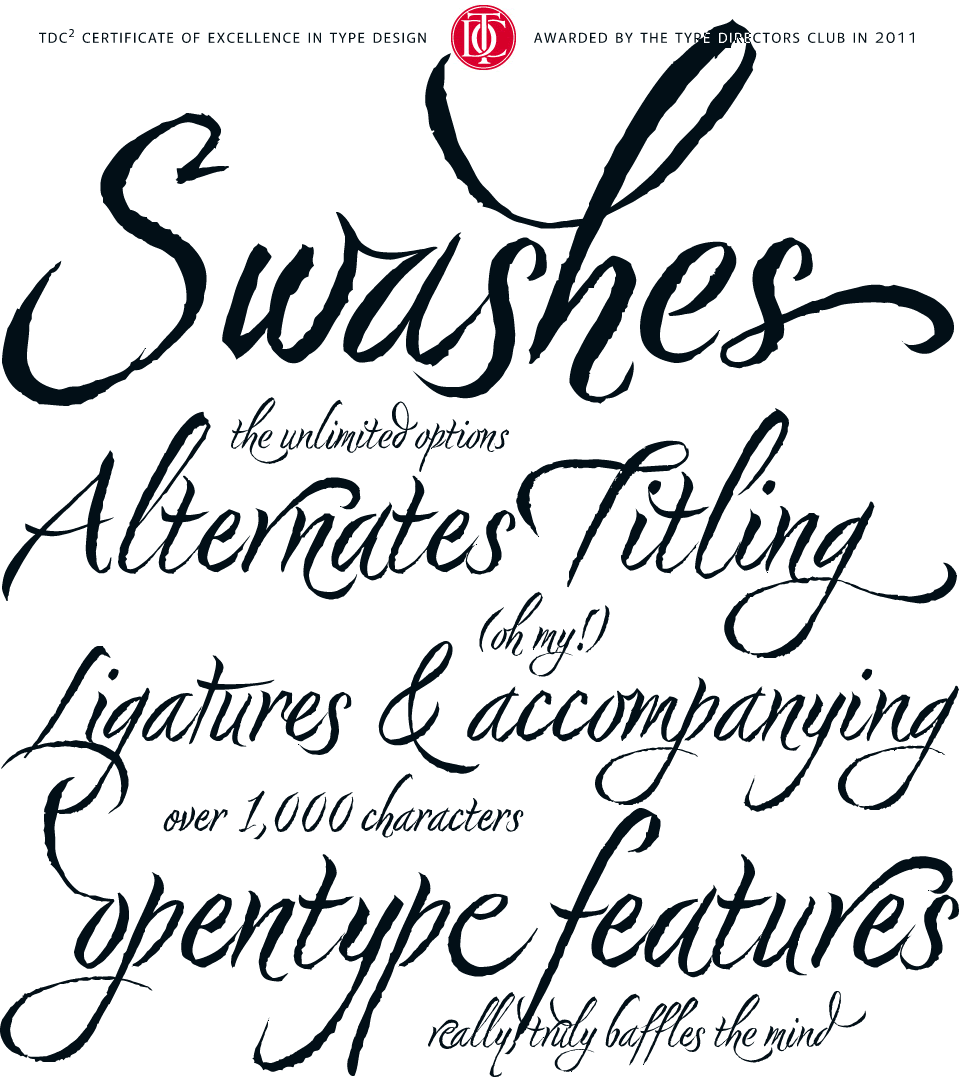 |
Nori by Niel Summerour, is a hand-lettered typeface that
contains over 1100 glyphs, 250 ligatures, 487 alternate
characters, 125+ swash and titling alternates, lining and
old style numerals.
|
Buying and owning fonts. This was a concept that was alien to me before beginning the graphic communications program. Fonts where just something that came along with Word. You had what you had and you made due with them. I knew nothing about where fonts came from, how I got the ones I had or that I could even get more.
Upon entering design school, I -- like many beginning designers -- dove head first into the free font sites. Countless different typefaces, all free for my using. "Why pay upwards of $40 for 'commercial' fonts when I can download all the fonts I could ever need for free," I thought.
Well, as time, experience and education often do, I was quickly shown the error of my ways and learned that free fonts are free for a reason, and even though I can download them for free, it doesn't mean that I can freely use them for any project. As outlined in the article, "Why are font so expensive?" from 1stwebdesigner.com , you truly do get what you pay for and an exorbitant number of these free fonts are very low quality. But what makes a font low quality? Free fonts will often lack consistency throughout letterforms, have irregular or "botchy" curves, have missing characters, very few will have any alternates or special ligatures or any thought given to kerning. Also, free fonts rarely come in more that one style or weight, drastically reducing their usage. In addition to this, many of these "free" fonts are only free for personal use. As soon as you use them commercially, licensure issues come into play.
OK, so now I knew why free fonts aren't all that they are cracked up to be, but I still didn't understand why professional quality fonts cost as much as they do. This I didn't learn until I began creating my own fonts. There is a huge amount of time that goes into the planning and drawing of characters in a font. This is some of what you pay for but the real value of commercial fonts comes in the technical aspects and math associated with them -- the attention given to spacing between specific letters. This is important, for example, because an "i" and "g" will fit together very differently than an "s" and a "g," and if all of the letters are just quickly knocked out and given the same spacing, it creates strange gaps and words become disjointed and therefore less legible. Commercial fonts will almost always come in different weights, making them much more useable for a variety of different purposes. In addition to this, many higher quality fonts, especially script and handwritten fonts, will come with a built in set of ligatures and alternates. These fonts will come at a higher cost as these special features require additional thought, planning and time executing them.
Friday, March 16, 2012
Graphics Math: Type Terms and Measurements
In his book, "The Newspaper Designers Handbook," Tim Harrower compares using type right out of the computer to wearing a suit right off of the rack. "It won't fit right until you tailor it a bit," Harrower said.
This means that we, as designers, need to pay close attention to the kerning, tracking, justification and leading of all of the type we use. Below are some standard type terms and their definitions.
Leading: The space between lines of type and is measured from baseline to baseline. Leading is not the same as line spacing. Line spacing measured in proportional measure (single, double, etc.). Where leading is measured in exact values, such as points.
Baseline: Where all the lowercase letters sit
Ascender: Things that go above the cap height
Descender: Things that hang below the baseline
Xhight: How tall the majority of all the lowercase letters are
Cap Hight: How tall the majority of the capital letters are
Kerning: The adjustment of the space between individual letter forms
Tracking: The uniform adjustment of spacing applied over a range of characters
Thursday, March 15, 2012
Typography: Moving from Paper to Pixels

 I have finally finished drawing out all of my lowercase letters and due to the time constraints of working within a school-year schedule have decided to jump into the software with them rather than finish the uppercase, numbers, punctuation, etc.
I scanned my drawings and have begun tracing the outlines in Illustrator, then I copy the paths into TypeTool to resize and adjust paths as needed. At this point, it appears that everything is working alright, but I'm afraid that the paths I am drawing in Illustrator are looking too smooth and polished, undoing the hand-drawn look that I am aiming for.
I keep reminding myself that this isn't the end-all be-all with this font and I can always go back and redo things. It's all part of learning process, I guess.
Wednesday, March 14, 2012
Tech Journal: "Design Elements" Chapter 4 Review Paper
Presentation Options: Image Composition and Styles
When putting together a layout of any kind it is incredibly important to carefully choose or create images that not only further the over all, literal message of the piece but also help further the emotional message or feel of the piece. This can be done a number of ways, with some of the most effective and most dramatic ways being through the composition of the visual through arrangement, crop, style and medium used.
An image is not only viewed in the positive, but also in the negative. As was discussed by the authors in previous chapters, this is what is referred to as the figure-ground relationship. It states that an images white space or background — or lack there of — provide as much meaning, although, perhaps not immediately recognizable to the viewer, as the actual focal point of the images. This is why arrangement and crop play such an important role when selecting images for design. This is especially true when dealing with illustrations as opposed to photographic images. This is because illustrations, as the authors note, “are not bound by the realities of arrangement imposed by the scene they are rendering.” This means that the designer is able to push and manipulate the figure-ground relationship an incredibly long way — much further than what is realistic, what could be presented in a photograph, in order to instill the overlying mood, or feeling of the piece. This abstraction of the figure-ground relationship “contributes to the illustration’s power to communicate beyond the literal as well as helps engage the viewer and direct the eye.
The placement of the focal point inside the white space also plays a role in the experience of the viewer. When the focal point of the image is centered in the frame, it projects a feeling of neutrality. It doesn’t force the viewers eye to move one direction or another and therefore creates little excitement. Conversely, when the focal point of an image is placed off center, the viewer must move his or her eyes across the image, from one side to another, causing excitement, but also a degree of anxiety. Along with the placement of the elements within the frame, their size also plays a large role in how they communicate with the viewer. A smaller object, with a good deal of space around it feels sad, lonely and isolated. It creates movement, but more slowly and more directly. Where a larger element, that fills up a good deal of the frame and maybe even spills out of it, creates a more chaotic, aggressive type of movement. The authors of the book referred to this type of format as feeling “confrontational.”
Perhaps, more than the placement in the frame or the crop of the image, the medium of the image itself has the biggest effect on how the viewer interprets and feels about an image. While many designs will only use one image style — representational, sketches or photography — a design can often benefit from mixing image styles. A mix of graphic element styles helps to create contrast in a design, a contrast that the authors say is “key to surprising, refreshing, and enlivening layouts.” But they do warn, that although the elements that are combined need to contrast, they also need to “share some visual qualities” as well as some visual meaning. Each type of imagery carries with it a specific association and designers need to recognize these associations and use them to their benefit. Photographs carry with them a documentary feel, they capture life as it is. They are “concrete, pure, environmental, and reliable.” Illustrations, on the other hand, are created from men’s and women’s imaginations. They come off as more abstract and present life not as it is, but as it could be or we feel it should be, “they evoke fantasy, display impossible or ideal situations, and portray their content in a subjective way — even if they are naturalistic.” Icons, symbols and translations break everyday objects down into their simplest forms in order to inform, direct or identify.
Because each different image style is tied to a connotation they, must be combined with care and purpose. For example, an aerial photo of a zoo being used as a map may be supplemented with symbols indicating concession stands, restrooms, giftshops, etc., and line art representing walking paths. The photo works as a map because it is truly and believably the layout of the zoo, and because the symbols are created art they stand out from the image and are instantly recognizable as what they symbolize.

Monday, January 30, 2012
Typography: Legibility, Context and Creativity

The idea of recognizable legibility deals with idea that the time period and current standards of normality play a huge role in what the view would perceive as easily readable. As explained by Bruce Willen and Nolen Strals in their book, Lettering & Type: Creating Letters & Designing Typefaces, "What was regarded as a clear and beautiful writing style for a twelfth-century Gothic manuscript is to today's readers as difficult to decipher as a tortuous graffiti script." They go on to say that what we, today, see as a clean, universally readable sans serif would have been viewed by nineteenth-century typographers as "crude and hard to read." For this reason, designers must always be conscious of the context in which their work will be viewed, and cater to it. After all, if a letter cannot be recognized as a letter and doesn't function as a letter, is it really a letter?
There is, as with most all aspects of design, a great deal of wiggle room for creativity in type design and lettering. This is because the inherent functionality of letters, as Willen and Strals note, comes, too, with a "surprisingly wide rage of emotions and associations -- everything from formality and professionalism to playfulness, sophistication, crudeness and beyond." These emotions and associations come from years of subjection to advertisers and branding. For example, the Giorgio Armoni logo is created with Didot Headline. Whenever we see Didot in other uses, either consciously or subconsciously, we equate it to Armoni or at least the high fashion, high price, clean, tailored look of Armoni. The same can be said of the modern (or at least before the age of Facebook), playful look of Arial Rounded Bold in the myspace logo or the friendly, corporate neutrality of Helvetica in the failed Gap logo (as well as countless other, more successful logos).
Also coming into play here, are display or feature fonts that aim to create a specific look, feel or emotion, not from a well recognized usage of the font, but from creative elements that the font designer built into the characters. This can be seen in cracked and grunge fonts, graffiti fonts, hand-written fonts, etc. These the use of these fonts, however, is widely disputed among designers.
This reminds me of some of the interviews in the 2007 documentary Helvetica. Some designers, such as traditional Modernist Massimo Vignelli believe type should be the vessel for the message, not the message itself. “I don’t think that type should be expressive at all. I can write the word ‘dog’ with any typeface and it doesn’t have to look like a dog. But there are people that [think that] when they write ‘dog’ it should bark.”
Conversely, David Carson, former graphic designer of Ray Gun magazine, said, commenting on a number words typed in Helvetica, "That doesn't say 'caffeinated' - it just sits there. Nothing caffeinated about it."
As a designer in today's climate, I feel that there are opportunities to utilize all of the fonts available to us. Obviously, a grunge font wouldn't be appropriate for all clients, but either is a traditional Helvetica. We just need to be acutely aware of the client and their needs as well as the specifics of their audience — their background … their normal — and cater directly to that.
Sources:
Lettering & Type: Creating Letters & Designing Typefaces by Bruce Willen and Nolen Strals
Helvetica (2007)
Tuesday, January 10, 2012
Tech Journal: "Design Elements" Chapter 3 Review Paper
Type as Information
Graphic Communication. Presenting information — educating, entertaining, inspiring — in an aesthetically pleasing format. It is often said that a picture is worth 1000 words, but a picture by itself will be interpreted differently by each person who views it. This is where type proves its worth. Not only can the words themselves literally say what the message of the piece is but the font choices and treatments, when used effectively, can help to further imprint the visual message. Typography, too, can help the viewer navigate a design, when directly or indirectly. This is why type must be chosen and presented carefully, with planning and consideration.
The presentation of type holds such a great deal of weight that the author refers to as “one of the designer’s most important tasks.” Specifically, it is important that the designer give the information an order, or structure. This is called hierarchy and when used effectively it allows the viewer to navigate through a design as was intended by the designer. Hierarchy should visually tell a viewer where to begin looking a design, what order to work through it and where to end. Therefore, hierarchy is essentially the importance the designer assigns to each element. As designers, we are often saddled with the task of determining what, in fact, is the most important aspect of the design that we want the viewer see first. This is done by first reading the text and then deciding what the viewer needs to see first.
This visual show of importance is done through a number of different ways. The spaces around and in between text can be manipulated to create different levels of importance. The size assigned to each element, too, will help develop these levels of importance. A well designed newspaper provides a very good example of this. The traditional formula for designing a news package is a large headline with a good amount of white space around it. This must be the first thing that a view sees as it will, in most cases, determine if they will read the rest of the story. The headline is , depending on space and availability, followed by a photo or graphic with a cutline tucked in close by and in some cases overlapping the photo. This proximity lets the viewer know that these two elements go together. The photo and cutline are usually followed by a smaller subhead and even smaller body copy. This order creates a level of hierarchy that lets the viewer know where to start and how to progress through the package.
With the newspaper as well as most design projects, a small number of fonts are selected for a specific purpose and then used throughout the design. This creates unity in the design. In most cases designers are warned against using more than three fonts in a design. When selecting fonts, the author stresses the importance of combining fonts that have similar qualities, such as “proportion, weight and terminal shape.” He says that it is not necessary to hit the viewer over the head with a font change when the content requires differentiation. This is because very small changes in type are easily recognized. A slight change will clue the viewer into a change but will also help to create unity and “interrelationships within the content.”
The placement of the type also indicates how it is related. Keeping related blocks of text closer together indicates that they are related while giving more space between text blocks indicates that they are not related. Likewise, shallow columns of text arranged horizontally with a space in between — that allows the viewer to differentiate the columns — indicate to the viewer that these short columns are directly related. I contrast, breaks in vertically aligned text indicates that the segments are unrelated. Along with grouping, using geometric forms — like bullet points for lists — or lines can help the viewer know what is related and what is not. This indication of relation allows the viewer to more easily navigate the design and aids in delivering the message correctly and as intended.

Source: "Design Elements: A Graphic Style Manual" by Timothy Samara
Tuesday, November 8, 2011
Tech Journal: "Design Elements" Chapter 2 Review Paper
Color Stories: Coding with Color
Color as information. It seems like a strange concept -— that is until you give it a little thought and realize that color alone can tell us which direction to turn the tap for hot water, what bus to get on for the route you need to take and even the gender of that newborn baby. For these reasons, color selection must be done carefully and with a good deal of forethought.
The author says that color coding is only affective when it is done simply. This allows the viewer to easily and quickly identify the systems and know what it means. This simplicity is achieved through using a minimal number of colors as well as using colors that are very easily distinguishable. Colors need be different enough to let the viewer know that the information is different. Close color combinations, however, can be useful in indicating sub-categories. For example, a set of health related brochures may have eye related pamphlet colored blue, the ear and nose related pamphlet colored green and the heart related pamphlet colored red. Then the pamphlet on high blood pressure pamphlet could be pink, tying it back to the heart pamphlet.
When planning a color system, the designer needs to leave some flexibility for growth and change. Also, the different parts of the system need to be distinguishable from each other while still holding on to the “family appearance.” This can be achieved by developing a family with a few colors in it and a few staple elements and then swapping these the colors of these elements. This allows the different parts to be distinguished as different but also be recognized as connected. Take for example, Herbal Essences hair care products. Each shampoo is tied to its corresponding conditioner by using the exact same bottle color, but they are differentiated by bottle shape. Then all of the different types of shampoo/conditioner combinations use a different, but very saturated color that ties them all together and unifies them as a whole. The are all connected, but easily distinguished as different.
When selecting a color system it is important to consider printing costs and the number of inks to be used. Where many color jobs will be process jobs — printed in CMYK -— it is also possible to get very similar results with just two, carefully selected spot colors. A spot color is colored ink with a specific color. This using a limited number of inks helps tie all elements printed with them together, helping further with branding. For this reason, spot colors are often used with corporate identities.
Since ink is translucent, these spot colors can be blended in different tints in order to create a number of different colors. This color overlap is called “surpinting.” When colors are created through surprinting, the resulting colors vary greatly in hue, saturation, and value. These variations are based directly on the base inks selected. The end, third-party color is usually darker and less saturated. However, the author says, if the base colors used are fairly vibrant this will result in a more intense third-party color.
This use of spot colors can also have some pretty cool affects on photographic images, especially those with higher contrasts. An image can be printed with one, two or three spot colors (color halftone, duotone, and tritone, respectively) in varied distributions to create an almost innumerable number of different looks and feels.

Source: "Design Elements: A Graphic Style Manual" by Timothy Samara
Wednesday, October 5, 2011
Tech Journal: "Design Elements" Chapter 1 Review Paper (2 of 2)
The Shape of Space and Figure/Ground Relationship
Just like specific forms elicit specific reactions in our brains, the shape of space, or the format, does as well. The author gives the example of a square format versus a vertical rectangle or a horizontal rectangle. A square is viewed as neutral, with no emphasis in either direction. This allows the viewer to really focus on the forms without giving much attention to the format at all. A vertical format, however, is perceived by the viewer as very confrontational, as it produces a simultaneous thrust downward and upward, causing the viewer to have to go over and over it. The horizontal format, on the other hand, relates back to the horizon and gives the viewer a sense of balance and calm. How the form and format interact can really add movement and interest to a design. A small form within a larger spacial format will have a closed-in, restrained feel, while a large form in the same format will seem “confrontational.” This relationship between form and space is also a relationship between positive and negative. The form, in most cases, is the positive with the space, or ground, serving as the negative. In some cases, a figure ground reversal occurs, where the form actually serves as the negative space, allowing the ground to come through as the figures. This play between positive and negative creates a hierarchy, provides the design with movement, and gives a three dimensional quality. The relationship between figure and ground can often become quite complex and should always be handled carefully as to not confuse the message of the design and ultimately confuse the viewer.
Just like when dealing with the figure/ground relationship, all forms in a design need to be “resolved” and “refined.” Resolve deals with each form having purpose for its position, size and interaction with other forms. Refinement refers to message that each form communicates. A refined form will very clearly communicate a single, unified message. These work together to ensure that all parts of a design are clear and have purpose. This logic of communication, not decoration should leave the visual consumer without questions and a comprehensive understanding of the intended message of the design. According to the author, a design that was not well planned or refined will leave the viewer both bored and uneasy.
Source: "Design Elements: A Graphic Style Manual" by Timothy Samara
Monday, October 3, 2011
Tech Journal: "Design Elements" Chapter 1 Review Paper (1 of 2)
For my design development class I read Chapter 1 of "Design Elements: A Graphic Style Manual" by Timothy Samara and wrote a paper and did a group presentation on the first part of the chapter. The first part of my paper and my part of the presentation follow.


Form and Space
The author of the book begins by describing graphic design, in its simplest form, as creating something nice to look at. He goes on to say that in order for it to be efficient design, though, it must be beautiful in a sense, well organized and not only help people understand what they’re looking at, but also help them feel and understand what it means to them on a deeper, emotional level. This is achieved by thoughtful selection, use and arrangement of form and space.
Form is described by the author as the “stuff: shapes, lines, textures, words and pictures.” It is what makes up the design and it should be chosen carefully and with reason. This is because our brains are hard wired to associate specific shapes, patterns, and layouts, no matter how abstract, with both physical objects as well as emotional feelings. The author uses the example of a circle. When we see the form, our brains relate it to the physical form the sun, moon, earth, a coin pearl, etc.
It is also the duty of the graphic designer to ensure that the forms in a design are not only picked with purpose, but also that they are presented beautifully. The author says that “beautiful” is not used in the traditional sense, but more in a “beauty is in the eye of the beholder” way, as aggressive, torn and chunky can also be viewed as beautiful. He goes on to say that “resolved” or “decisive” could perhaps serve as synonyms for beautiful when talking about design. This means that if all of the designs parts are related to each other with no one part feeling “alienated” and if the design form feels “confident, credible and on purpose” and all of the individual forms work together as a whole, the design is beautiful.
Form, however, cannot exist on its own. It needs somewhere to reside. This “somewhere” is called space. The physical embodiment of space in graphic design is really just the size and shape of the finished project — a business card, poster, magazine spread, Web page, television screen, etc.


Source: "Design Elements: A Graphic Style Manual" by Timothy Samara
Thursday, September 29, 2011
Tech Journal: 32-Page Booklet Layout and Imposition
This past week in class we worked on producing a 32-page booklet. We set it up in a way that after you fold, staple and cut you ended up with a 32-page booklet with all of the pages in the correct order. This made for a tricky impo, and folding dummies proved invaluable.
The steps we took and a diagram of the reader's and printer's spreads follows:


- Begin with a 32 page InDesign document with each page measuring 4.24"x5.5" (a quarter of a page)

- Layout and save
- Create an eight page InDesign document with each page measuring 8.5"x11" (letter sized) for impo file
- Use folding dummy to properly layout impo

- Place 32 pages into correct spot on impo file
- Print two sided
- Fold each of the four sheets into quarters separately
- Place folded sheets inside of each other

- Staple
- Cut top
Wednesday, September 21, 2011
Typography: Introducing Hornbeam
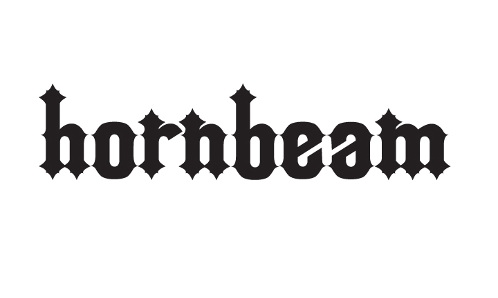
Last week I attended a workshop by Minneapolis based font designer Chank Diesel. Since then I have had the idea in my mind that I need to create my own font. While sitting through a lecture recently, I sketched out half of a lowercase "h" on the bottom of a quiz and hornbeam was born. I named it hornbeam because those were the first letters I created. I later found out that a hornbeam is a type of tree. Unrelated, I know.
I now almost have the whole lowercase alphabet finished and am excited to start on uppercase and for my first font ever I think it looks pretty good. I am really looking forward to being able to type with a totally original font. I'll share the entire font when I get that far. Until then, let me know what you think of these first characters.
Thursday, September 8, 2011
Tidbits: Personal Summary Statement
In my media writing class we were asked to write a personal summary statement for a resume or possible employer in 140 characters or less (the maximum length of a tweet). Summing yourself up in 140 characters is difficult enough, but when saddled with the challenge of making it stand out among the 35 students in my class — or the possibly even larger number of people that would be applying for a job — made it a truly taxing task. Mine is as follows:
Graphic designer, copy editor and ag. enthusiast with five years experience in newspaper and print design. Skilled in InDesign, Illustrator.

Thursday, July 21, 2011
Going Deeper: The Balancing Act that is Graphic Design
Design is the search for a magical balance between business and art; art and craft; intuition and reason; concept and detail; playfulness and formality; client and designer; designer and printer; and printer and public.
— Valerie Pettis
Connecticut-based Graphic Designer
“Design is the search for a magical balance …” This part of the quote by Connecticut-based graphic designer Valerie Pettis really sticks out in my mind. I think that this is the one things that I have really learned through my classes and teachers in the graphics program at Southeast Tech., that graphic design is truly a balancing act. In every design, designers are saddled with the task balancing a whole host of contrasting ideas to create visual pieces containing both aesthetically pleasing art and a specific message. But what is a graphic designer and does it actually take to be one, besides a good sense of balance, that is?
Through this post I will explore what a graphic designer is, the qualifications, skills and education required to be a design professional, the basic duties of a designer, as well as the job specifics, such as job availability and projected median pay.
Through this post I will explore what a graphic designer is, the qualifications, skills and education required to be a design professional, the basic duties of a designer, as well as the job specifics, such as job availability and projected median pay.
Graphic design combines art and technology to communicate ideas. The designer works with a variety of communication tools, primarily image and typography, in order to convey a message from a client to a particular audience. Designers create, choose, and organize these elements — typography, images, and the so-called “white space” around them — to communicate a message.
Graphic designers use many drawn, painted, photographed, and now computer-generated images to create the design for graphics and layouts for a variety of visual pieces and formats such as print pieces, including business cards, letter heads, posters, fliers, brochures, maps and info-graphics. They might also develop the entire layout of magazines, newspapers, journals or websites.
In addition to these finished projects, they also design the letterforms that make up various typefaces that can be seen everywhere from movie credits and TV ads to books, magazines, and menus, and even on computer screens. There would be no electronic words anywhere if a designer hadn’t created the fonts first.
In the graphic design profession, it is often the case that formal training is not necessarily needed to be successful, but often it can be difficult to pick up the required skills well enough to make a living without at least some sort of degree in art or graphic design. For most professional graphic design positions, it is required that the applicant have a bachelor's degree, although many entry-level technical jobs only require an associate degree.
Through professional design training, either a bachelor’s or associate degree program, fledgling designers usually receive knowledge of studio art and design, commercial graphics production, computerized design, and website development and design. One major part of these programs is that they allow the design students the opportunity to complete of number of original, professional type projects and skills sets in order to put together a good portfolio before entering the job market, which is often crucial in getting a job.
Along with postsecondary training, creativity, communication, and problem-solving are very important skills for a designer to posses and develop. Designers must be creative and able to communicate their ideas visually, verbally, and in writing. They also must have an eye for details.
Because consumer tastes can, and often do, change fairly quickly, designers also need to widen their world-view by keeping up with professional design literature, being open to new ideas and influences, and must be able to react quickly to changing trends. The abilities to work without direction and under the pressure of deadlines are equally important traits. Other important skills needed by designers are the self-discipline to start projects on their own, the ability to budget their time, and to meet deadlines and production schedules. In addition to these, good business sense and sales ability can also prove themselves useful to designers, especially for those who plan to freelance or manage their own firms.
It is also very important that graphic designers keep up with new and updated computer graphics and design software, either on their own or through formal software training programs.
Rapid growth is projected for the graphic design field as well as the jobs associated with it. Employment of graphic designers is expected to grow 13 percent, as fast as the average for all occupations from 2008 to 2018, as the continued growth of the Internet will provide many new job opportunities, and businesses will always have the need for visually appealing documents and communication to help with their advertising and marketing. However, growth may slow due to reduced demand for print publishing, where many graphic designers are employed.
The average annual wages in May 2008 for graphic designers were $42,400. The middle 50 percent earned between $32,600 and $56,620, while the lowest 10 percent earned less than $26,110, and the highest 10 percent earned more than $74,660. A more specific breakdown can be seen in the chart below:
Position | Average Salary (As of May 2008) |
Staff Level Designers | $45,000 |
Senior Designers | $60,000 |
Solo-Freelance Designers | $57,000 |
Design Directors | $95,000 |
Design Firm Owners/Partners | $95,000 |
With the growth of the industry expected to continually climb with new technologies, skilled, creative and dedicated newcomers should find it a welcoming industry to work their way into and advance their careers in. They will join a new generation of proverbial trapeze artists in the balancing act that is the graphic design field.
Sources:
Graphic Designer: Educational Requirements for a Career in Graphic Design
Graphic Design: A Career Guide and Education Directory by Sharon Helmer Poggenpohl
United States Department of Labor, Bureau of Labor Statistics
Tuesday, April 26, 2011
Creative Process: Sketching Thumbs and Roughs
The creative process in a very personal one. Every creative person has their own unique way of generating ideas and then, in turn, getting them out into the world. One thing that has been stressed in my classes is the importance of sketching out thumbs and roughs as the first step in the actual creation of a project.
My design teacher can often be heard saying, "You need to get your ideas out and on to paper," and "Usually your first ideas are no good. You need to get through that crap quickly and on to the good stuff."
This is why I (usually) spend a couple minutes after research to sketch out four or five different ideas for the final project. Just a couple minutes is all I allow myself and all I really need to move past the crap to the good stuff.
Then from my sketch I can more easily go into the software and create good quality, well thought out projects.
In his article, "The Role of Sketching in the Design Process," Sean Hodge boils it all down to five main reasons for sketching.
- Rapid Concept Development
- Basic Composition or Layout
- Client Communication and Approval
- Visual Exploration
- Refining Visual Solution
Hodge provides some really good explanations and visual examples and I, being inspired by the article, decided to include a video of my brainstorm sketching of a t-shirt project that I am currently working on. I hope to put together a video of my entire creative in future, but we'll just have to see about that.
Monday, April 18, 2011
Opacity v. Tint
I have found as a fledgling designer that it is often easy to get switched around when it comes to the difference between and proper usage of tints and opacities.
On a white background, a 30% black tint and a 30% opacity black will look similar (with the opacity slightly darker), but don't be fooled – they are very different.
An opacity allows the designer to adjust the level of transparency that an object has. This means that all other objects below it can be seen through it, where as a tint will essentially adds white to a pure hue, lightening it, but allowing it to remain opaque.

Thursday, April 14, 2011
An Introduction to Web Fonts
For this post, I just pulled together some facts about current Web font basics to form a bit of an introduction to Web fonts. As with everything on the Internet, Web fonts are growing and changing rapidly, so much of this information will probably already begin to be outdated by the time I hit the "Publish Post" button.
What are Web fonts?
• Web fonts are defined as the collection of fonts which are considered “safe” for Web use. Because the display of fonts on the Web largely depends on the viewer’s font collection, it is common practice to use fonts which are already installed on a large percentage of viewer’s computers. Unfortunately, good statistics on font installation is hard to find. As a consequence of this, as well as the fact that designers disagree about the percentages that make a font “safe,” there is no definitive list of web safe fonts. However, Times/Times New Roman, Helvetica/Arial, and Verdana are generally considered among the safest.
How are Web fonts used?
• Currently, there are a limited number of fonts that are considered “safe” to be used online because they are commonly installed on most PCs and Macs and should therefore be available on the end users machine. That is the limiting factor with the Web, you can only use fonts that are available on the end users machine. This is why Web designers usually specify a number of similar font choices when coding text specifics. If a non-standard font is specified and the user doesn’t have it, the font will default to the next one in the list or a generic font.
• There are other possibilities with installing fonts remotely, but these are still not 100% foolproof and don’t really offer a reliable alternative to using plain old CSS.
• An example of this is @font-face, a CSS rule which allows the user to download a particular font from your server to render a webpage if the user hasn’t got that font installed. This means that Web designers will no longer have to adhere to a particular set of “Web safe” fonts that the user has pre-installed on their computer. The latest versions of Safari and Firefox and Google Chrome support @font-face and Opera is planning to support it soon. Internet Explorer has supported it since 5.5.
What are the benefits of creating new Web fonts?
• One of the advantages of working with web fonts is that companies and organizations that use a certain typeface for their identity can now easily extend their brand to their online presence.
• Designers have more creative freedom and are not limited to “safe fonts.”

Sources:
– The Web Designer’s Typographic Glossary — Design Pepper
http://designpepper.com/blog/post/the-web-designers-typographic-glossary/
– Method and Class: “Which font work on the Web”
http://www.methodandclass.com/article/font-on-the-web/
– What is @font-face
http://www.font-face.com/#lime_content
– World Wide Web Consortium – CSS Web Safe Font Combinations
http://www.w3schools.com/css/css_websafe_fonts.asp
What are Web fonts?
• Web fonts are defined as the collection of fonts which are considered “safe” for Web use. Because the display of fonts on the Web largely depends on the viewer’s font collection, it is common practice to use fonts which are already installed on a large percentage of viewer’s computers. Unfortunately, good statistics on font installation is hard to find. As a consequence of this, as well as the fact that designers disagree about the percentages that make a font “safe,” there is no definitive list of web safe fonts. However, Times/Times New Roman, Helvetica/Arial, and Verdana are generally considered among the safest.
How are Web fonts used?
• Currently, there are a limited number of fonts that are considered “safe” to be used online because they are commonly installed on most PCs and Macs and should therefore be available on the end users machine. That is the limiting factor with the Web, you can only use fonts that are available on the end users machine. This is why Web designers usually specify a number of similar font choices when coding text specifics. If a non-standard font is specified and the user doesn’t have it, the font will default to the next one in the list or a generic font.
• There are other possibilities with installing fonts remotely, but these are still not 100% foolproof and don’t really offer a reliable alternative to using plain old CSS.
• An example of this is @font-face, a CSS rule which allows the user to download a particular font from your server to render a webpage if the user hasn’t got that font installed. This means that Web designers will no longer have to adhere to a particular set of “Web safe” fonts that the user has pre-installed on their computer. The latest versions of Safari and Firefox and Google Chrome support @font-face and Opera is planning to support it soon. Internet Explorer has supported it since 5.5.
What are the benefits of creating new Web fonts?
• One of the advantages of working with web fonts is that companies and organizations that use a certain typeface for their identity can now easily extend their brand to their online presence.
• Designers have more creative freedom and are not limited to “safe fonts.”

Web safe fonts chart courtesy of www.w3schools.com.
Sources:
– The Web Designer’s Typographic Glossary — Design Pepper
http://designpepper.com/blog/post/the-web-designers-typographic-glossary/
– Method and Class: “Which font work on the Web”
http://www.methodandclass.com/article/font-on-the-web/
– What is @font-face
http://www.font-face.com/#lime_content
– World Wide Web Consortium – CSS Web Safe Font Combinations
http://www.w3schools.com/css/css_websafe_fonts.asp
Subscribe to:
Posts (Atom)