

Thursday, January 24, 2013


Wednesday, January 23, 2013

Monday, April 2, 2012
Going Deeper: Newspaper Design vs. Magazine Design
Newspapers and magazines. Both convey information through text, photos, graphics and illustrations. Both reach millions of people every day. Both have traditionally been a prime example of print media. The similarities are high, but their differences outnumber these greatly.
Newspapers target a large population, while magazines are more specialized. Magazines are more editorial (entertainment based), where newspapers are largely factual (information based). Newspapers often have a much quicker turnaround time, coming out daily, bi-weekly or weekly, while many magazines are monthly or even quarterly. Magazines are typically printed on a heavier, glossier paper and newspapers are printed on a thiner, porous paper. For these reasons, as well as many others that I didn't list, newspaper and magazine design differs greatly.
The factual, 'hard news' format of newspapers is, perhaps, the most significant reason for the differentiation in design. The strict, column-based grid structure of newspapers projects credibility. This comes from years and years of similar newspaper design. We as consumers, tend to give more trust to the things that we are familiar with. A reverse example of this, is the adoption of this type of layout by gossip tabloids. By printing on newsprint and adhering to a newspaper-like column structure, they hope to appear credible and factual. Newspapers are also dictated by a number of other factors, including a quick turnover time, lower quality paper, whether or not they will have color, etc.
Because magazines are typically more entertainment based, they are able to play with design more as they are not bound by the constraints of being the watch dog informant. They are also almost always full color and printed on a heavier, glossy paper stock, allowing for more detailed, intricate designs.
As of recent though, newspapers have begun to morph and change slightly in order to compete as a print product living in a digital age and are becoming more design heavy and magazine-like as to attract readers and get them their information in an easily manageable and relatively entertaining way.
Newspapers target a large population, while magazines are more specialized. Magazines are more editorial (entertainment based), where newspapers are largely factual (information based). Newspapers often have a much quicker turnaround time, coming out daily, bi-weekly or weekly, while many magazines are monthly or even quarterly. Magazines are typically printed on a heavier, glossier paper and newspapers are printed on a thiner, porous paper. For these reasons, as well as many others that I didn't list, newspaper and magazine design differs greatly.
The factual, 'hard news' format of newspapers is, perhaps, the most significant reason for the differentiation in design. The strict, column-based grid structure of newspapers projects credibility. This comes from years and years of similar newspaper design. We as consumers, tend to give more trust to the things that we are familiar with. A reverse example of this, is the adoption of this type of layout by gossip tabloids. By printing on newsprint and adhering to a newspaper-like column structure, they hope to appear credible and factual. Newspapers are also dictated by a number of other factors, including a quick turnover time, lower quality paper, whether or not they will have color, etc.
Because magazines are typically more entertainment based, they are able to play with design more as they are not bound by the constraints of being the watch dog informant. They are also almost always full color and printed on a heavier, glossy paper stock, allowing for more detailed, intricate designs.
As of recent though, newspapers have begun to morph and change slightly in order to compete as a print product living in a digital age and are becoming more design heavy and magazine-like as to attract readers and get them their information in an easily manageable and relatively entertaining way.
Friday, March 30, 2012
Tech Journal: Types of Printing
Xerography = Dry printing. A dry pigment is 'cooked' on top of the paper. Widely used as general office printing because it is cheap and quick, however lower quality. Not cheapest option for very large quantities.
Inkjet = Common household. Words best on photo paper. Liquid ink squirts out drops of ink as the paper goes by.
Sublimated Dye (Dye Sub) = Uses some kind of solid ink. A solid sheet of color (similar to carbon paper).
Photographic = Dark room processed with special papers and chemicals.
Sheet-fed Offset = Most common general printing in print shops. Uses liquid ink, paper not on roll - separate sheets are fed into the printer. Much less expensive for large quantities than xerography.
Web-fed Offset = Large scale. Newspapers, magazines.
Gravure Printing = A surface is engraved or scarred with tools or chemicals. The scratches get filled with ink and then pressure forces the ink onto paper. The highest quality, detailed printing. Currency is printed this way. The opposite of rubber stamping or flexography.
Flexography = Utilizes a flexible relief plate (similar to a rubber stamp). It can be used for printing on almost any type of substrate including plastic, metallic films, cellophane, and paper.
Screen Printing = Printing on fabric. Most successful if solid or has textures that don't have to look perfect
Monday, March 26, 2012
Industry Profile: Bell, Inc.
A couple weeks ago, I had the opportunity to tour Bell, Inc. in Sioux Falls. Bell is well known across the country for their packaging and shipping products. With clients ranging from UPS to McDonalds, they specialize in:
- Comprehensive packaging services
- Folding cartons
- Overnight envelopes and mailers
- Food packaging
- Quick serve restaurant and convenience store packaging
Tuesday, March 20, 2012
Tech Journal: "Design Elements" Chapter 5 Review Paper
Layout Systems
Almost everything that is designed is part of some sort of system. From a website having multiple connected pages, to the actual physical pages of a book, magazine or newspaper, they all have a connection. Too, is the idea of serial production. The author of the book use the example of a magazine or newspaper being produced periodically, each having different content, but all tied under the one masthead. A systems can also be seen in a series of publications, such as brochures or advertising campaigns. The key to any system is the idea of unity. They viewer of user needs to be able to visually connect the pieces of system in order to know that they truly are connected.
This visual connectedness is extremely important and should be strictly adhered to ... to a point. For example, if every page of a magazine follows the exact same grid structure and image placement, the viewing experience as a whole will be static and lifeless. However, if the designer allows for some flexibility in their design, they create visual tension, which leads to a more lively, energetic viewing experience. But, just like too much consistency is kills energy, too much flexibility kills unity. The perfect balance of consistency and flexibility creates interest while maintaining unity.
Finding this perfect balance can be done a number of ways. Perhaps the easiest way, is to change the color palette or the images used, while keeping the size and position of the rest of the elements exactly the same. This can prove a drastic change in the look of the pieces, while allowing them to stay unified through unchanging staples. Another way to do this is through pacing, or changing the “frequency of different page components in some kind of pattern.” By changing sizing, placement and color densities of elements on different pages of a multi-page document it is possible create that desired interest and energy, but it is important to maintain a common grid structure on all pages to retain the sense of unity.
Flexibility can also be achieved through formal variation. This is achieved by identifying key characteristics in a design — imagery, geometric relationships, depth, movement — and then focusing on altering a couple of them to create interest, without changing “fundamental character.”
This idea of formal variation and the earlier discussed idea of differing components in some kind of pattern, come together to help the designer create a pacing or sequencing within a design. The author likens this to a “kind of cadence or ‘timing’ that the reader will apprehend from part to part.” This cadence is created through varying placement of type, image and white space and can help the designer achieve a number of different objectives. The most obvious of these is just the visual change from page to page creates interest and engages the viewer. In addition, pacing can also help to indicate a change in content — from something as simple as an indention or space between paragraphs, to more complex ideas such as symbols or colored boxes. Good use of pacing can also help to facilitate navigation, such as how the viewer should approach a printed page or how they should click through a website.
The author warns though, that even though all designs will benefit from some degree of flexibility and variation, it is important to decide what method and to what degree on a case by case basis. This will ensure that the message of the pieces comes across clearly and as intended, and that the needs of the client are met.

Source: "Design Elements: A Graphic Style Manual" by Timothy Samara
Sunday, March 18, 2012
Typography: The Cost of Fonts
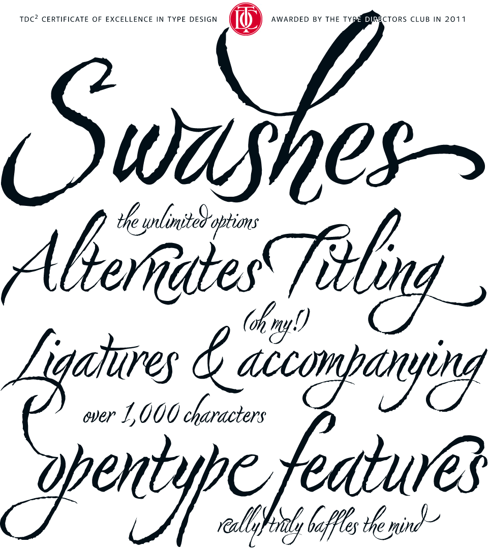 |
Nori by Niel Summerour, is a hand-lettered typeface that
contains over 1100 glyphs, 250 ligatures, 487 alternate
characters, 125+ swash and titling alternates, lining and
old style numerals.
|
Buying and owning fonts. This was a concept that was alien to me before beginning the graphic communications program. Fonts where just something that came along with Word. You had what you had and you made due with them. I knew nothing about where fonts came from, how I got the ones I had or that I could even get more.
Upon entering design school, I -- like many beginning designers -- dove head first into the free font sites. Countless different typefaces, all free for my using. "Why pay upwards of $40 for 'commercial' fonts when I can download all the fonts I could ever need for free," I thought.
Well, as time, experience and education often do, I was quickly shown the error of my ways and learned that free fonts are free for a reason, and even though I can download them for free, it doesn't mean that I can freely use them for any project. As outlined in the article, "Why are font so expensive?" from 1stwebdesigner.com , you truly do get what you pay for and an exorbitant number of these free fonts are very low quality. But what makes a font low quality? Free fonts will often lack consistency throughout letterforms, have irregular or "botchy" curves, have missing characters, very few will have any alternates or special ligatures or any thought given to kerning. Also, free fonts rarely come in more that one style or weight, drastically reducing their usage. In addition to this, many of these "free" fonts are only free for personal use. As soon as you use them commercially, licensure issues come into play.
OK, so now I knew why free fonts aren't all that they are cracked up to be, but I still didn't understand why professional quality fonts cost as much as they do. This I didn't learn until I began creating my own fonts. There is a huge amount of time that goes into the planning and drawing of characters in a font. This is some of what you pay for but the real value of commercial fonts comes in the technical aspects and math associated with them -- the attention given to spacing between specific letters. This is important, for example, because an "i" and "g" will fit together very differently than an "s" and a "g," and if all of the letters are just quickly knocked out and given the same spacing, it creates strange gaps and words become disjointed and therefore less legible. Commercial fonts will almost always come in different weights, making them much more useable for a variety of different purposes. In addition to this, many higher quality fonts, especially script and handwritten fonts, will come with a built in set of ligatures and alternates. These fonts will come at a higher cost as these special features require additional thought, planning and time executing them.
Subscribe to:
Posts (Atom)