
 |
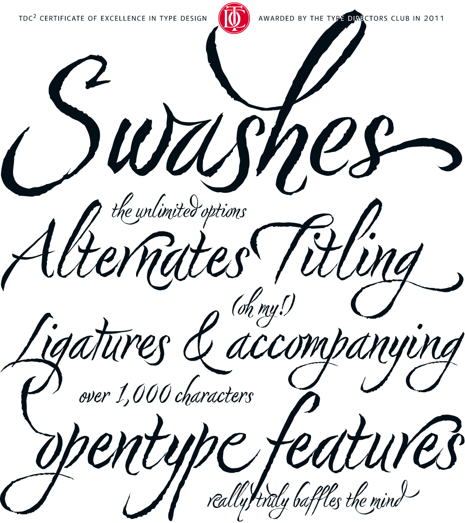
Nori by Niel Summerour, is a hand-lettered typeface that
contains over 1100 glyphs, 250 ligatures, 487 alternate
characters, 125+ swash and titling alternates, lining and
old style numerals.
|
Buying and owning fonts. This was a concept that was alien to me before beginning the graphic communications program. Fonts where just something that came along with Word. You had what you had and you made due with them. I knew nothing about where fonts came from, how I got the ones I had or that I could even get more.
Upon entering design school, I -- like many beginning designers -- dove head first into the free font sites. Countless different typefaces, all free for my using. "Why pay upwards of $40 for 'commercial' fonts when I can download all the fonts I could ever need for free," I thought.
Well, as time, experience and education often do, I was quickly shown the error of my ways and learned that free fonts are free for a reason, and even though I can download them for free, it doesn't mean that I can freely use them for any project. As outlined in the article, "Why are font so expensive?" from 1stwebdesigner.com , you truly do get what you pay for and an exorbitant number of these free fonts are very low quality. But what makes a font low quality? Free fonts will often lack consistency throughout letterforms, have irregular or "botchy" curves, have missing characters, very few will have any alternates or special ligatures or any thought given to kerning. Also, free fonts rarely come in more that one style or weight, drastically reducing their usage. In addition to this, many of these "free" fonts are only free for personal use. As soon as you use them commercially, licensure issues come into play.
OK, so now I knew why free fonts aren't all that they are cracked up to be, but I still didn't understand why professional quality fonts cost as much as they do. This I didn't learn until I began creating my own fonts. There is a huge amount of time that goes into the planning and drawing of characters in a font. This is some of what you pay for but the real value of commercial fonts comes in the technical aspects and math associated with them -- the attention given to spacing between specific letters. This is important, for example, because an "i" and "g" will fit together very differently than an "s" and a "g," and if all of the letters are just quickly knocked out and given the same spacing, it creates strange gaps and words become disjointed and therefore less legible. Commercial fonts will almost always come in different weights, making them much more useable for a variety of different purposes. In addition to this, many higher quality fonts, especially script and handwritten fonts, will come with a built in set of ligatures and alternates. These fonts will come at a higher cost as these special features require additional thought, planning and time executing them.
No comments:
Post a Comment